#94: Ranking the 2026 NWSL Kits
The NWSL 2026 kits dropped, so of course we have to rank them.

taps mic
Is this thing on?
It's been a little over a week since I posted here. I went to visit family at the beach last week, and as much as I thought that I'd be able to step away and put out a newsletter or two, I wasn't able to.
What's more, we're approaching Selection Sunday and baseball season, so with the work I'm doing with Winsidr, The Athletic, and Baseball Prospectus (and my real job(s)), I'm up to my ears in it.
HOWEVER.
I wanted to put out these rankings. Not only do I enjoy ranking the NWSL kits, but it's also a celebration of sorts.
We've been doing this little newsletter for a year now, with my first post happening on February 24 and my second on the 27th. That second one was looking at the 2025 NWSL kits.
Happy one-year birthday, Walking Bucket. You grow up so fast, you little bastard.
Anywhoo.
There are more serious topics to write about, which I hope to do for Monday. I also have some fun ones planned, but this is the time of the year where I'm busiest with all of my work, so I appreciate the patience.
I'll give you a discount as a member going forward. Instead of charging you nothing per issue, I'll charge you nothing for the full year.
There, are we square?
Anywhoo Part 2, let's get into the kit rankings.
Like we did last year, we'll be ranking the worst to first.
No. 16: Utah Royals FC
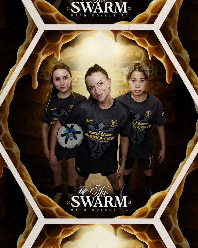
These jerseys could be beautiful and they would still be last with their America First-ass sponsor. Luckily, the jerseys are also hideous. I'm sorry, Utah fans.
No. 15: Denver Summit FC
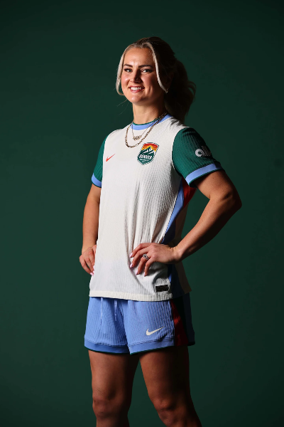
It's not just because they stole a team from Cleveland, but these jerseys are just kind of underwhelming, no? I get playing it safe and trying to integrate the vibe of Colorado, but this feels like a missed opportunity to make a statement like Boston did (more on that later).
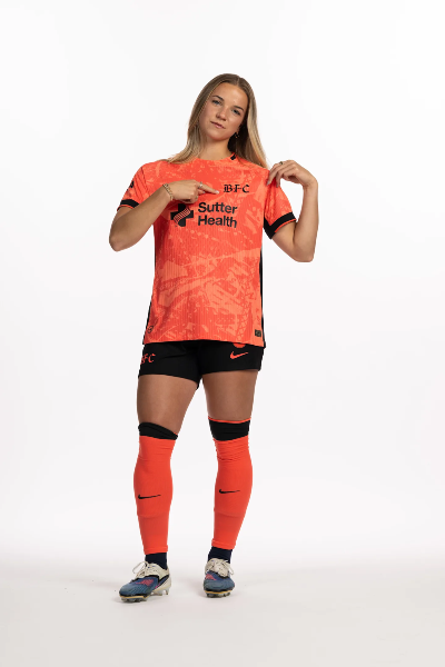
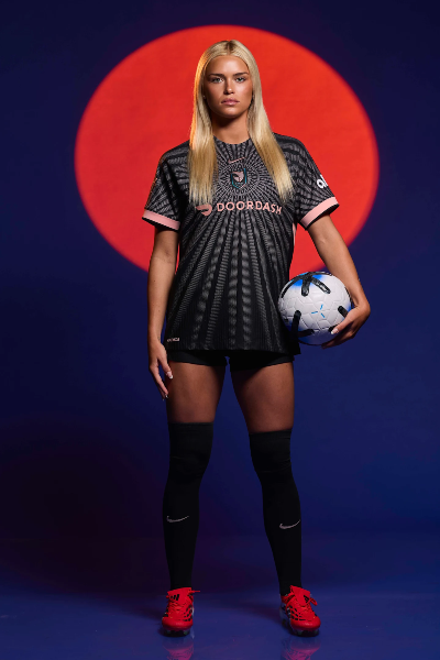
No. 14: Houston Dash
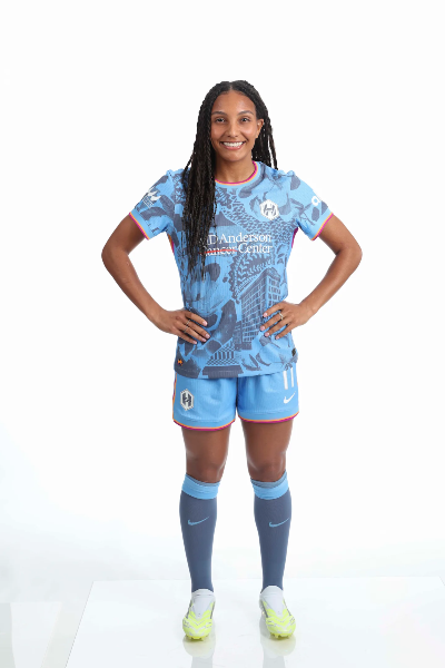
There's a little too much going on here, so maybe Denver did play it safe? I applaud the effort with trying to tie in all the references to the city - and the blue is beautiful - but instead of seeing something new each time I look at it, I see too much each time.
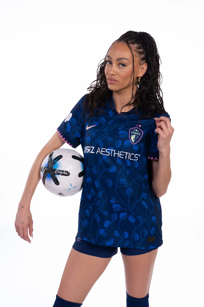
No. 13: San Diego Wave FC
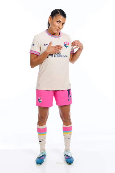
You know what it is? I think I just don't like the tan color of the jerseys. It's probably because I'm pasty as fuck, but I just can't get with it. Your colors pop, San Diego! Show them off.
No. 12: Seattle Reign
This feels like someone told the team "we have to put out our new kit" and they totally forgot that there was a deadline coming up, so they just put the first thing out that they could think of. It wouldn't surprise me if this was a men's league if they said "the first ever jersey designed by AI!"
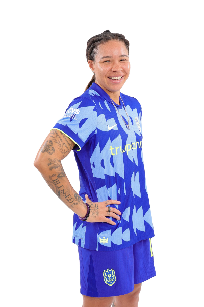
No. 11: Bay FC
The main color here is gorgeous. That, alone moves it up. Pairing with the black accent really makes it pop, too, but if there's a clear design on the kit, I can't make it out.
No. 10: Kansas City Current
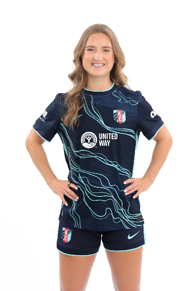
Listen, this top 10 fucks. All of these kits are incredible, so it's hard to differentiate them. I love this Kansas City design. No notes.
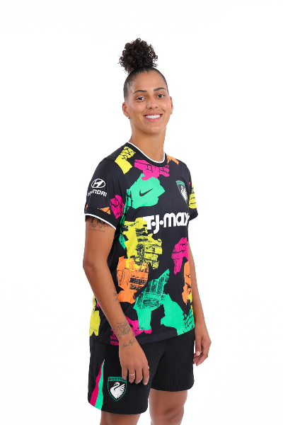
No. 9: Portland Thorns FC
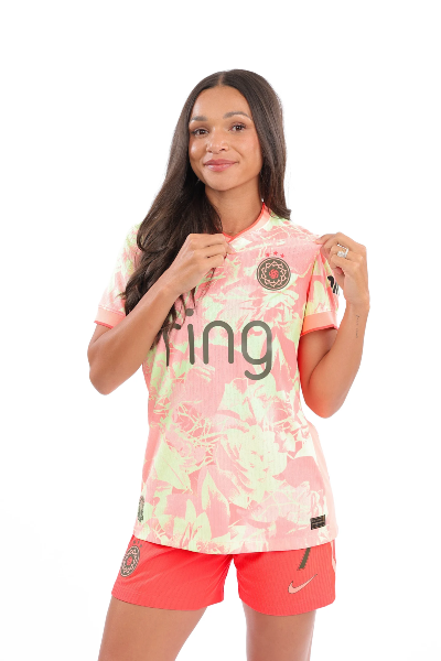
Ugh, if we have to differentiate, I guess I have to punish Portland for the sponsor. The promotional video was tone deaf given everything with Ring and Ice. If not for the sponsor, this would be top three. I love this color scheme. I love it so much.
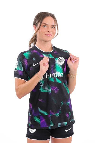
No. 8: North Carolina Courage
Girl, listen. The blue and the pink pop and make this a gorgeous kit. But can we talk about the Venus flytrap pattern? 10/10, no notes.
No. 7: Angel City FC
I went from hating this, to loving it, to liking it a lot. I love how the pattern directs you up to the badge.
No. 6: Racing Louisville FC
When I interviewed Emma Sears last week, she told me that the Racing kit was "sleek." She didn't mention that it was sleek, as fuck. The disco design is perfect, and while it would be too much for a regular kit, it's the perfect third kit.
No. 5: Boston Legacy
I love loudness. It's why I loved the Brooklyn Nets Basquiat-themed jerseys. These remind me of those and it's one hell of a splash for your inaugural season. Take notes, Denver.
No. 4: Gotham FC
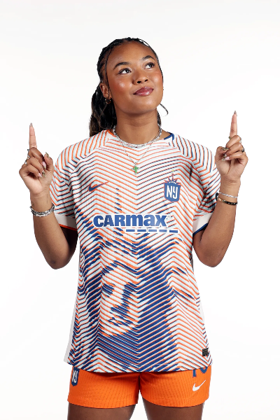
We reward creativity and enguiniety here. Gotham achieves that with its Lady Liberty kits. Their regular kits are gorgeous, and these are a nice complement to them. Leave it to the women in New York to dominate the jersey scene (and the winning championships part).
No. 3: Orlando Pride
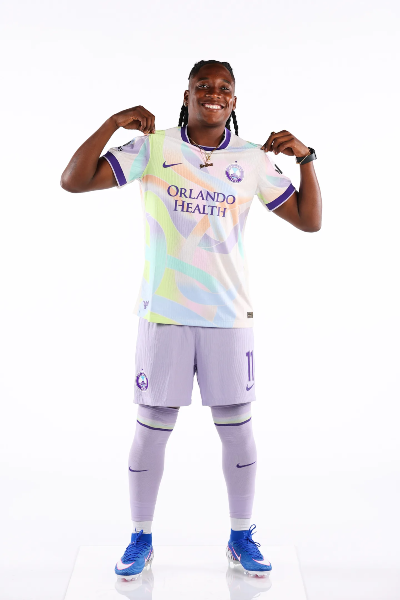
Orlando just never ever misses with its kits. This, again, is perfection achieved. You could have it No. 1 or No. 2 and I wouldn't argue with you. It keeps its personality while adding complementary colors for an elegant, fresh look.
No. 2: Chicago Stars
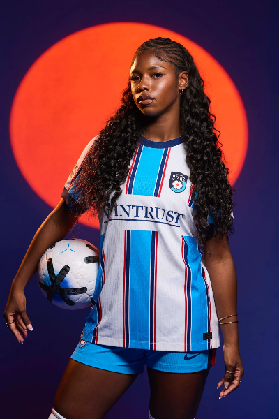
This is how you make a simple design stand out. It screams Chicago with the city flag, but the vertical stripes gives it a clean look. Well done, Chi-town.
No. 1: Washington Spirit
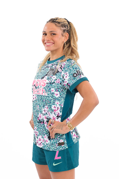
Are the Spirit my favorite team? Yes. Did that have to do with this ranking? Maybe. Am I thrilled not to be a walking highlighter if I want to buy a kit? You bet your ass. What an incorporation of the cherry blossoms with this kid with the wildflowers and Potomac River background.